Nanoleaf's light canvas: triangle aisles, one app counter, four regional doors, checkout donations
Official homepage: https://nanoleaf.me
Smart-home stores usually sell you a utility — see the door, warm the room, lock the deadbolt. Nanoleaf sells you a canvas, and that choice dictates everything downstream. The storefront opens on “lifestyle technology,” modular panels, and AI-powered promises, a strange trio until you remember the company began as three founders living inside a Chinese factory for six months to perfect the most efficient bulb they could build. I browsed with a blank wall and a weakness for products that turn installation into composition. Here is the canvas, decision by decision.
Door Policy: Lighting as Canvas, Not Commodity
The positioning line is a canvas for personal expression that just happens to light up — a refusal of the bulb aisle’s wattage vocabulary. The homepage sorts the store into experiences — immersive, everyday essentials, wellness — and behind that sorting sits category creation: if the product is a canvas, the competitor is the blank wall, the poster, the renter’s boredom. Premium pricing can live where commodity lighting cannot follow, and the door is built to walk shoppers there.
Starter Kits as the Revenue Floor Plan
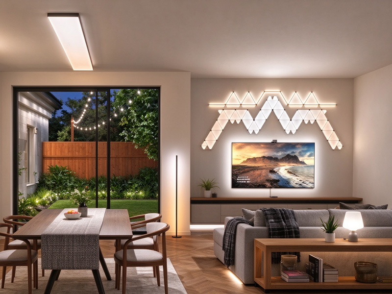
The core inventory is a modular system — triangles, hexagons, light lines — sold as starter kits with expansion packs, flexible linkers, and mounting hardware stacked beside them. The grid reads like a construction toy, and the starter-kit-plus-expansion architecture is the floor plan of the business: the first box defines the hobby, every later box enlarges it. Even components with artificial scarcity, like the audio sensor, arrive as announced drops, turning supply limits into calendar events instead of frustration.
One Catalog, Two Households
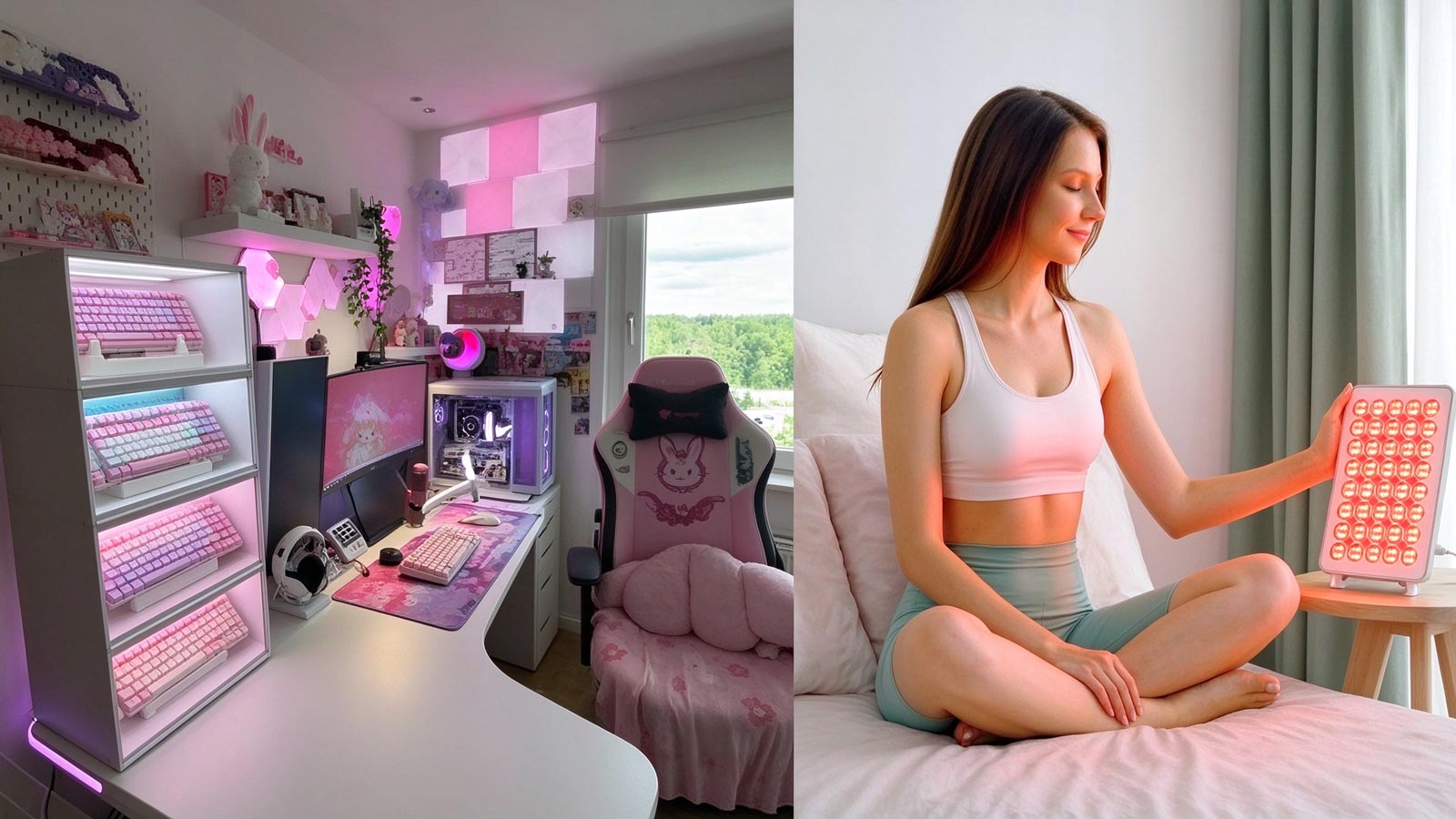
The catalog splits into immersive gear that mirrors a monitor or pulses to music, and everyday essentials such as bulbs and light strips, with a wellness shelf of rhythm lighting in between. Gamers and grandparents share one roof: the enthusiast funds the spectacle, the essentials line funds the routine repeat purchase, and the app stitches both into a single ecosystem. Cross-selling is engineered into the floor plan rather than left to chance at the cart.
A Single App as the Only Clerk
Every product page funnels to the same fixture — one app across iOS, Android, Windows, and Mac that connects, customizes, and controls the whole catalog. Scenes, schedules, music sync, and screen mirroring live there, so hardware is sold once and its features arrive as software, indefinitely. Documentation and community layouts orbit the same app, and the storefront becomes the front desk of an operating system rather than a shelf of boxes.

Regional Doors as a Conversion Decision
The .me domain is global, but the company’s case file describes four regional storefronts fed by local warehouses — native languages, local currencies, delivery without surprise customs charges. Shipping anxiety gets treated as a conversion problem: a canvas that arrives with a customs ransom note is not a canvas. The regional split also lets campaigns roll out country by country, so a promotion in one market never bleeds into another’s margins.
Charity, Engineered Like a SKU
The checkout once carried a small fixture: a donation product with preset amounts, built as a hidden Shopify line item wired into the cart as a checkbox. Running philanthropy through the same machinery as mounting hardware — a product type, a collection rule, a theme customization — makes giving permanent infrastructure instead of a seasonal banner. It costs little, stays on brand, and never asks the customer to leave the store to do good.