Illustrated packaging at chamberlain: seasonal boxes, spill-friendly copy, bundles, and a pinterest collab
Official homepage: https://chamberlaincoffee.com
Coffee stores usually lead with origin. Chamberlain Coffee leads with a face — Emma Chamberlain’s name is printed on the door among the badges, and the whole shop feels like her kitchen counter scaled up. I browsed with autumn fatigue and a weakness for packaging that treats a coffee bag like a storybook cover. The store is illustrated, seasonal, and far louder about feeling than about altitude. Here is the counter, decision by decision.
Review Numbers Posted Twice, on Purpose
The homepage shows a 4.62 average across 21,700 reviews; the all-products shelf shows 4.8 across more than 43,000. Two tallies in two places reads as placement, not sloppiness — the scoreboard follows the shopper from the door inward, so social proof is never more than a scroll away. Beneath it, three badges compress the entire pitch: USDA Organic options, freshly roasted, created by Emma Chamberlain. The founder’s name runs as a fourth badge, and printing it on the door rather than hiding it in an about page is the distribution strategy in a single line.
Subscription Box Moved to the Front
The first carousel slot belongs to the Fall Seasonal Box — a $100 value priced at $69, labeled limited edition, stocked with the season’s blends plus a branded cup and socks. Anchoring the entrance with a quarterly box is a conversion play: it turns a browsing fan into a recurring commitment before she has picked a favorite roast, and it hands the brand a release calendar to market against — fall box, winter box — the way fashion houses schedule drops.
Trends and Seasons Run as Inventory Events
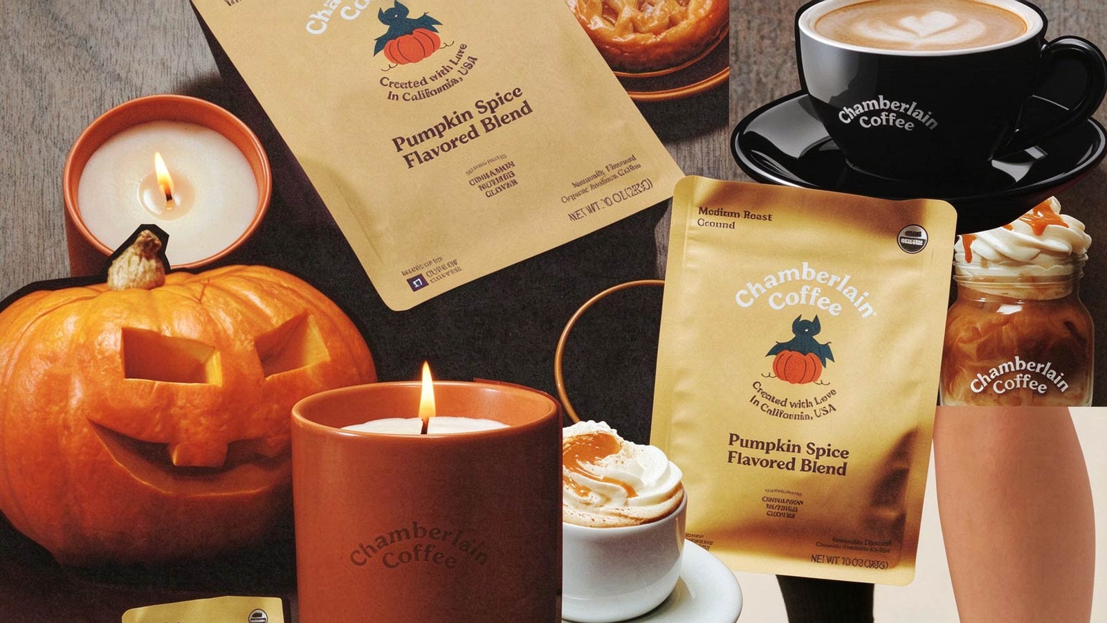
The next shelf, Wilderkind, names its inspiration openly — Pinterest’s trend forecast — and stocks woodland fauna, pastel florals, a deer on the coffee bag, a hedgehog on the blanket. Beside it, a full banner runs the older calendar: “Your favorite fall flavor is back,” announcing the Pumpkin Blend’s return. The merchandise is dated proudly; nothing pretends to be evergreen, and the shelves carry their timestamps like magazine covers.
Packaging Budgeted as Media
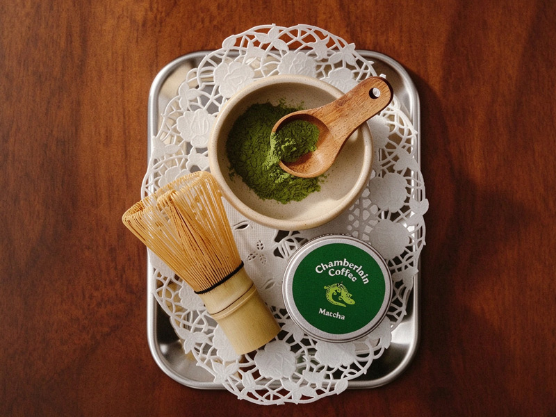
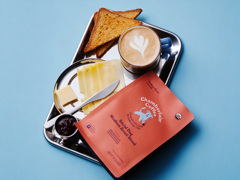
The bags and tins carry hand-drawn fauna — deer, hedgehogs, a small crocodile on the matcha tin — in a storybook register that photographs as well on a bedroom shelf as in a feed. Spending the illustration budget on packaging is a media buy: the coffee is consumable, but the visual system is collectible, which is what lets a syrup bottle and a $98 blanket live in the same world and land in the same basket. The drawing style is the signature; the beverage is the carrier.
Copy That Forgives the Spill
The brand paragraph grants permission mid-pitch — enjoy every “sip, slurp and spill (it happens)” — and calls drinks “sources of joy, inspiration and creativity in a cup.” That parenthetical is a tone policy, not a joke. The store declines the reverent cupping vocabulary of specialty coffee and sells comfort instead, to an audience that finds ceremony exclusionary, and every product page inherits the same register.
Bundles Positioned as the Default
The shelves mark their own combinations — the matcha set at $54 against $60, the almond-and-syrup pair at $38 against $42, a Wilderkind collection promising savings up to 20 percent — and every tag prints the crossed number beside the landed one. Bundling shows up often enough, and transparently enough, that buying the pair feels normal rather than upsold; the register does its arithmetic in the customer’s sightline.
The Price Ladder, Left in the Open
Tickets run from an $18 blueberry syrup through $24 coffee bags and $30 matcha up to the $98 blanket, with free shipping at $75 — a threshold that nudges a bag-and-mug order one item higher. Underneath sits a structural bet: coffee is the entry point, lifestyle goods carry the margin, and the ladder stays visible so the customer can climb it knowingly.