Caveman coffee store review: what to check before ordering small-batch coffee in 2026
Official homepage: https://cavemancoffee.com
Coffee stores usually name their roasts after places — valleys, estates, altitudes. Caveman Coffee names them after the ice age: the shelf runs Mammoth and Sabertooth, Daybreak and White Gold, Blacklisted and a Rainforest Reserve — a catalog that reads like a natural history museum crossed with a roaster's invoice. I browsed with a fondness for brands that commit to a bit and a curiosity about whether the prehistoric names hid a modern operation. Here is the counter, decision by decision.
Door Policy: The Ice Age as the Menu
The catalog's naming system is the storefront's personality — a dark roast called Sabertooth, a medium called Mammoth, a light roast called Daybreak — each name a small story that says more about the cup than a region ever could. Committing to a prehistoric theme is memorability aimed at the customer who forgets which Colombian valley she liked but remembers which extinct animal: the names are the flavor mnemonics, the theme is the brand's entire aesthetic, and the store has turned its coffee bags into trading cards. The ice age is the menu; the menu is memorable; and the memorable menu is the cheapest marketing the store will ever buy, because customers repeat the names for free.
Butter in the Beans
Among the roasts sits a functional line — a Mammoth Plus blended with MCT oil, the canister aimed at the butter-coffee crowd that wants its caffeine with a side of ketosis. Selling a fat-fortified coffee is use-case expansion aimed at the customer who drinks coffee as fuel rather than ritual: the MCT oil is the functional claim, the Mammoth base is the familiar flavor, and the store has entered the biohacking aisle without leaving the coffee aisle. The butter is the bridge; the bridge leads to a second customer the roaster never had; and the second customer brings a friend who only drinks coffee with a blender.
A Tea Can With a Coffee Brand's Name
The newest can on the site is not coffee at all — a sparkling hibiscus tea, organic, five ingredients, ninety milligrams of caffeine, no added sugar, the label announcing its arrival at a famous Los Angeles grocer. Extending into ready-to-drink tea is category bridging aimed at the afternoon customer who has hit her coffee limit: the can is the same brand, the hibiscus is the differentiator, and the five-ingredient list borrows the transparency the coffee line already owns. The tea is the second shelf; the second shelf doubles the basket; and the basket now contains something for the three o'clock that coffee cannot serve.
The Shelf Announcement as Advertising
The tea's debut carries a retail partner — a high-end Los Angeles grocer whose name functions as a certification — printed across the banner in the kind of type usually reserved for awards. Announcing the retail placement is credibility aimed at the customer who has never heard of the brand: the grocer's name is the filter the customer already trusts, the shelf presence says the brand survived a buyer's scrutiny, and the store has imported the grocer's reputation into its own checkout. The shelf is the endorsement; the endorsement is not for sale, which is why it works; and the working is printed in banner type.
Two Addresses on Every Bag
The bags carry a pair of coordinates — the origin on one side, a town called Spring Grove, Illinois on the other, the roast happening where the beans land. Printing the roast town beside the origin is freshness positioning aimed at the customer who suspects coffee of sitting in warehouses: the Illinois address says the roast is domestic and recent, the origin says the beans are exotic, and the pair together says the distance between farm and cup is measured in weeks, not months. The two addresses are the supply chain, printed on the front; and the supply chain, printed on the front, is a promise the warehouse cannot break without the customer noticing.
Color as the Flavor Key
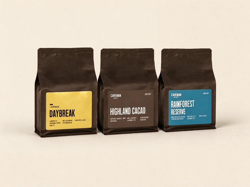
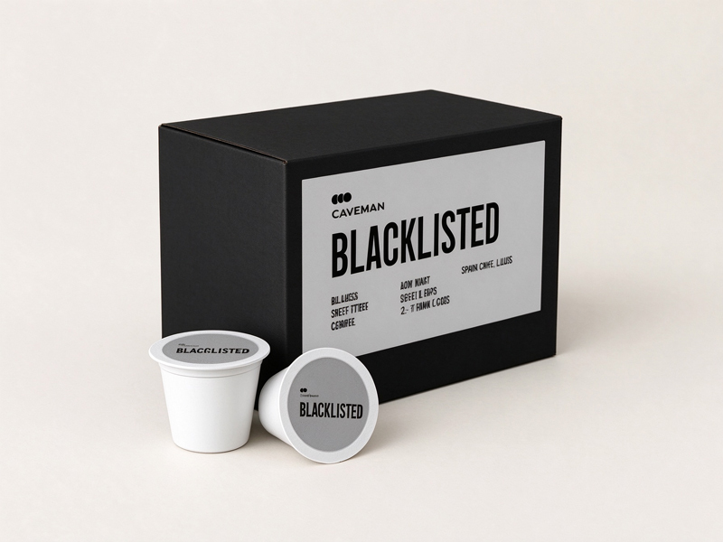
The packaging system is a set of color blocks — yellow for Daybreak, white for White Gold, black for Blacklisted, blue for the rainforest — the flavor readable from across the shelf before a word is read. Assigning a color to each roast is scannability aimed at the repeat buyer: the color is the reorder, the name is the confirmation, and the store has compressed the entire catalog into a rainbow the customer memorizes without trying. The color is the SKU; the SKU is the loyalty; and the loyalty is earned one glance at a time, and the glance takes less than a second, and the second is all the shelf ever gives you.
The Anti-Shelf Manifesto
Beneath the products sits a slogan that reads like a policy — roasted fresh, never sitting on a shelf — backed by a shipping threshold that waives the fee at three bags. Pairing the freshness claim with a three-bag incentive is volume-and-velocity aimed at the stock-up buyer: the slogan says the roast is recent, the threshold says the economics favor buying in threes, and the store has converted its freshness promise into a basket-size argument. The freshness is the claim; the three bags are the catch; and the catch arrives still warm from the roaster, or at least close, and the closeness is the difference the slogan was written to guarantee.
The Names Behind the Names
The deeper catalog keeps the bit going — Highland Cacao from Antigua, the Rainforest Reserve from Costa Rica — the playful names attached to real origins and real processing notes. Keeping the whimsy while printing the geography is credibility aimed at the customer who suspects novelty brands of hiding commodity beans: the Antigua SHB is on the label, the Costa Rica is on the label, and the store has let the origin report card sit beside the joke. The joke is the door; the origin is the floor; and the floor is solid enough to hold a Mammoth, and the Mammoth is what the customer remembers, and the remembering is the repeat order.