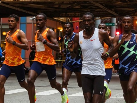
SAYSKY store review: what to know before you buy running clothes online
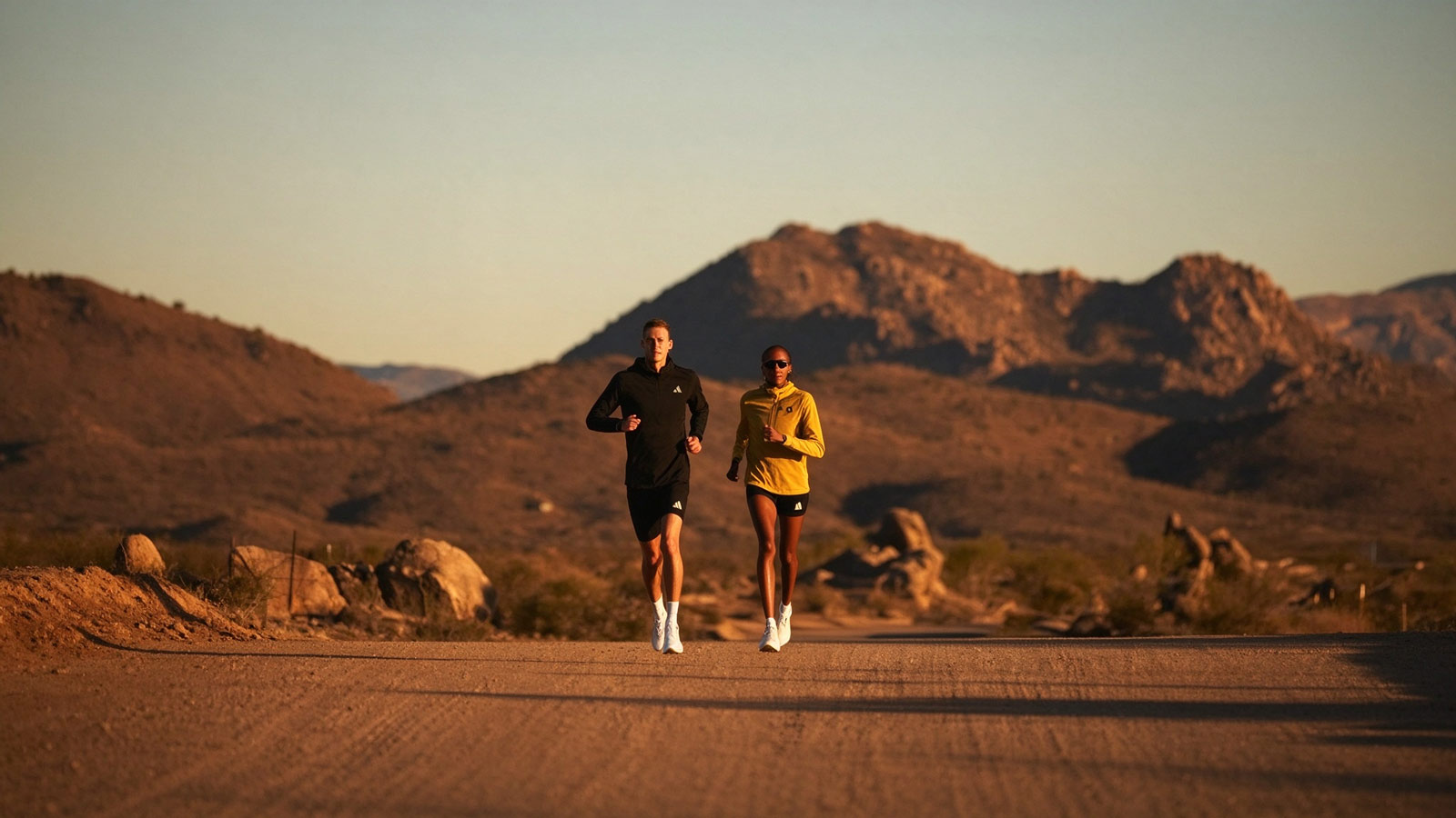
Official homepage: https://saysky.com
Running stores usually begin with the product. SAYSKY begins with the city — the storefront's founding story starts on the streets of Copenhagen, where the founders sold their first pieces through the specialist running shop next door and cheered at the local marathon from a bicycle with speakers. A decade later, the store has grown into an international catalog with a sneaker giant's logo riding its homepage, and the smile the founders started with is still the brand's most consistent design feature. I browsed with a closet full of earnest, muted running gear and a suspicion that the sport had forgotten how to have fun. Here is the counter, decision by decision.
Door Policy: The Smile as a Specification
The brand's positioning, repeated in every collaboration announcement and product story, is that running should be fun — smiles to every step, as the press puts it — and the homepage's bright palettes, playful graphics, and unserious photography follow through without irony. Building a performance brand on cheerfulness targets the runner tired of the category's suffering aesthetic: the smile on the product page says the miles can be enjoyed rather than endured, and it filters for the customer who runs for the feeling rather than the finish time. The smile is the positioning, and it costs nothing to manufacture — the fun is free, and everything else pays for it.
Six Lines for Six Kinds of Effort
The catalog divides not by garment but by intensity — a line for daily training, a line for high-intensity sessions, one for technical performance, one for versatile comfort, one for casual off-run wear, and one armored against wind and weather. Segmenting by effort rather than product type targets the runner who shops by Tuesday's workout rather than by category: she finds the combat line when the session is intervals, the pace line for the recovery jog, and the store quietly becomes the wardrobe for her entire training week. The intensity taxonomy turns a clothing rack into a training plan, and the plan renews itself every week.
A Giant's Logo on a Small Brand's Homepage
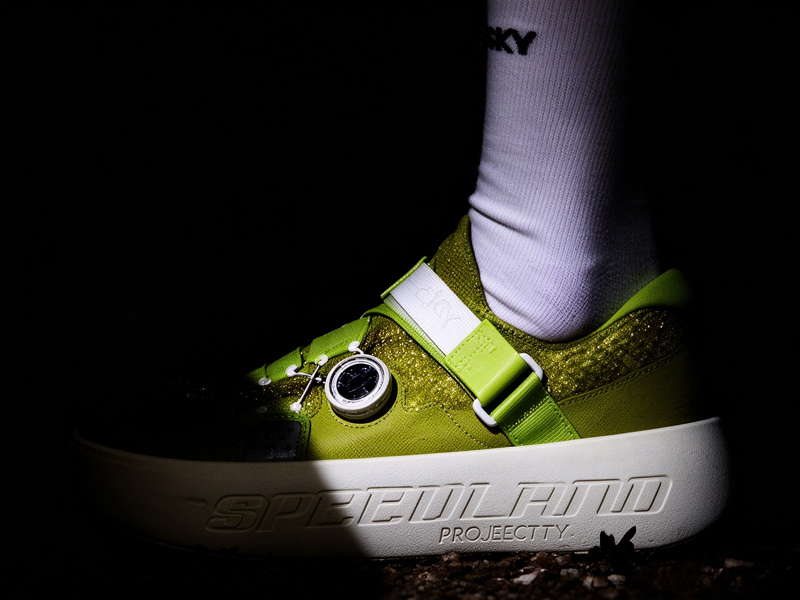
The store's most prominent fixture is a collaboration — a global sportswear giant's logo beside the brand's own, a second seasonal drop of sneakers and apparel announced with blockbuster fanfare. Partnering with the giant is a credibility decision aimed at both directions: the giant borrows the indie brand's aesthetic language and community warmth, the indie brand borrows the giant's engineering budget and retail reach, and the customer gets a shoe that carries both a smile and a spine. The partnership lets a small Copenhagen house sell at three hundred dollars without blinking, and the giant's lawyers do the heavy lifting on the patents.
The Magic Star as a Heirloom
Buried in the catalog's history sits the brand's first icon — a small star printed on the knee of a pair of tights, instantly recognizable to the community, still echoed in current designs. Keeping the star as a recurring motif conserves an asset the long-time customer already owns: the star is the brand's signature, the old-timers spot it across a race course and nod, and the motif costs nothing to print while returning the loyalty of a decade. A tiny symbol, carrying a decade of goodwill, and goodwill that outlasts every product cycle the catalog churns through.
The Bicycle With Speakers
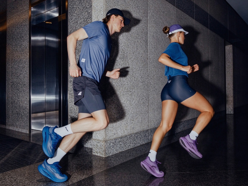
The origin story includes a detail most brands would omit — a friend on a music bicycle, riding the marathon course handing out high-fives, a ritual the copy says the company still performs. Publishing the ritual is community positioning aimed at the runner deciding between two similar vests: the brand that plays music on the course is the brand that is still on the course, and the story tells the customer the community is not a marketing construct but a practice. The bicycle is the brand's character witness, and it has testified at every Copenhagen Marathon since the beginning — longer than most of the garments in the catalog have existed.
Two Alphabets on One Label
The product photography shows the label rendered in more than one writing system — Latin beside Japanese characters on the caps and tees, a quiet acknowledgment of the brand's Eastern following. Multilingual labeling acknowledges the market directly: the runner in Tokyo wears the same star as the runner in Copenhagen, and the label becomes a passport the community shares. The second alphabet costs nothing extra to print and buys a second market's affection, and affection in two alphabets is twice as hard for competitors to counterfeit.
Bundles and a Loyalty Engine
The commercial architecture is plainspoken — performance bundles at twenty percent off, and a loyalty club promising rewards, stacked beneath every category page. Bundling by workout set and running the club openly lifts the average order while keeping the customer inside the brand between purchases: the runner who buys the session kit saves money, joins the club, and the club keeps her warm until the next drop. The bundle is the hook; the club is the net; the star is the reason neither feels like commerce. And commerce that does not feel like commerce is the only kind that renews itself.