Harry’s website review – a close‑up look at its DTC grooming shopping experience

Official homepage: https://www.harrys.com
I found my way over to Harry’s site while hunting for direct‑to‑consumer grooming stores to test out. I clicked around for an hour — product pages, brand story, checkout flow — to see what it's actually like to shop here.
Browsing Through Their Product Collections
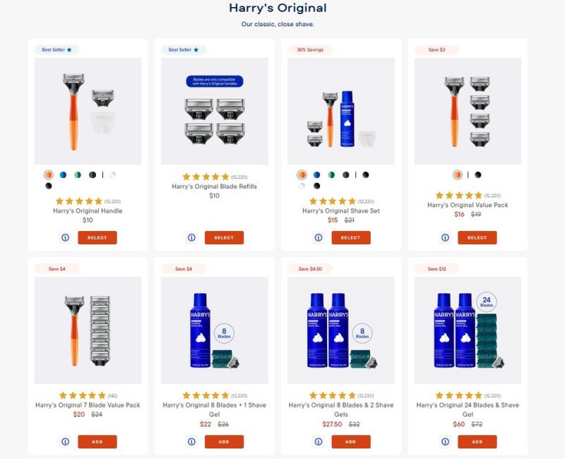
The grid is clean. Star ratings show right on the listing, sale prices are crossed out, and there's a big "SELECT" button under each item. I could tell what's popular without opening a dozen tabs. Bundled sets, starter packs and blade refills sit side‑by‑side, so I could easily compare standalone items against multi‑item savings packs at a quick glance.
But there's no filter. I couldn't narrow by price or type, so I had to scroll through everything. Scrolling through the full catalog grew tedious once I moved past their top‑selling lineup. I also found that only the star summary shows up on the grid; to read actual written reviews, I had to click into each product individually. There was no way to quickly skim real‑world feedback while staying on the browse page.
Behind‑the‑Scenes Manufacturing & Brand Storytelling
I clicked their "Our Story" link expecting the usual marketing fluff. Instead, they showed actual photos from inside their razor factory — the machines, the workers, the whole process. It felt less like a grooming brand and more like a company that's actually proud of where their stuff comes from. Seeing shots of the production floor gave me a tangible sense of their supply chain, something most online grooming retailers skip over entirely.
I also checked their "Our Story" page. It's all Harry's own content — no user forums, no community posts. The page walks you through their founding mission, pricing goals, and the background behind their factory purchase. If you want real buyer opinions, you're stuck clicking into individual product reviews. There is nowhere on the main site for shoppers to chat, share tips or post photos outside of those isolated product‑review tabs.

Site Layout, Mobile Flow & Marketing Touchpoints
I clicked around between categories to see if the site lags. It doesn't — pages load fast, no weird jumps. The whole thing looks consistent, which is nice. But then I hit the SMS signup popup at the bottom of every page. No obvious way to close it for good, and no "how to unsubscribe" link next to the offer. Just "give us your number."
Closing Thoughts After My Site Tour
After spending hours navigating, what stuck out most to me was the contrast between Harry’s strong front‑end shopping experience and some of the small information gaps hidden deeper on the site. Product grids are clear and transparent, their willingness to showcase factory operations sets them apart from many competing retailers. Even so, missing browsing filters and intrusive marketing pop‑ups create small but annoying friction points that shoppers will run into along the way.