Rumpl's printed atlas: park patches, artist-signed corners, recycled fill, and a leatherman picnic
Official homepage: https://rumpl.com
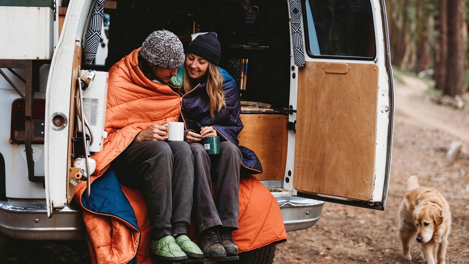
Camping stores usually organize by the sleep system — pad, bag, tent, done. Rumpl organizes by a rectangle of synthetic warmth and then refuses to stay in one aisle. The door when I visited said “Cozy AF,” an odd slogan for an outdoor brand until you see the territory being claimed: the hours around the campsite, the couch after it, and every hard surface in between. I browsed with a forecast of forty degrees and a weakness for blankets that photograph better than my tent. Here is the shop, decision by decision.
Door Policy: Claim the Whole Trip, Indoors to Outdoors
The homepage runs two banners at once. The first argues for staying in — new layers, warmer textures, zero reasons to leave the couch. The second, set right beside it, is a three-brand drop with Leatherman framed as “unfold, uncork, unwind,” for the days you actually earn. Holding both is a territory grab: the store refuses to choose between the after-hike blanket and the pre-hike multitool, and claims every hour of the trip as sellable space. That is a far larger market than any single gear category, and the door says so without modesty.
Collaboration Fixtures Run on a Calendar
Three collab shelves stand in a row, and each is dated. The RAD Artist series commissions illustrators for full-bleed prints — a breaking wave, a desert scene with a rattlesnake — with the artist’s signature stitched small in the corner. The National Parks line assigns each park its own print and woven patch. The Leatherman drop is pure occasion: mat down, cork out, cup full. Collaborations here run as scheduled inventory events rather than surprise stunts — exactly what a Shopify Plus build is for, and per the company’s own case file, the platform choice was made with these drops in mind.
One Material Grammar Across 152 SKUs
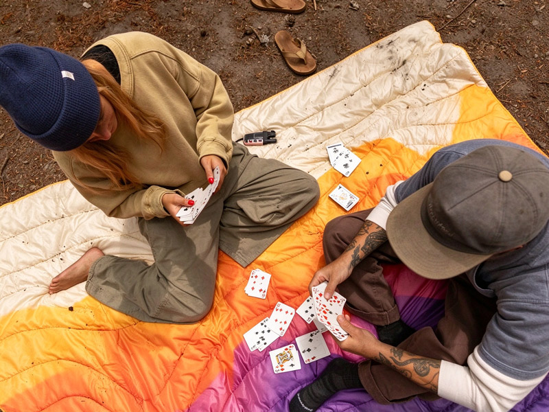
The all-products shelf counts 152 items, and underneath sits a single language: recycled synthetic fill, quilted shells, printed faces. The Original Puffy anchors the range at $99.95 with more than 4,600 reviews; the Wrap Sack 20° sleeping bag at $249.95 wears a conservation award badge; the Camp Pillow at $59.95 answers the one question no camper escapes. Ponchos, towels, mats — every extension is the same rectangle reconsidered for a new surface. A customer who trusts the fill never re-learns the catalog, and a warehouse that speaks one material language runs cheaper than one that speaks five.
Product Pages That Carry Their Own Labels
The Camp Pillow’s image is a diagram — cool side, warm side, arrows and dotted lines. The sleeping bag wears its award badge on the product photo itself. Review counts ride the cards in the thousands, not dozens. The pictures annotate themselves instead of burying detail in a spec tab, the way a good shopkeeper writes prices on tape. It shortens the road from browsing to confidence without a single line of sales copy.
Pricing Without a Fiction of Discounts
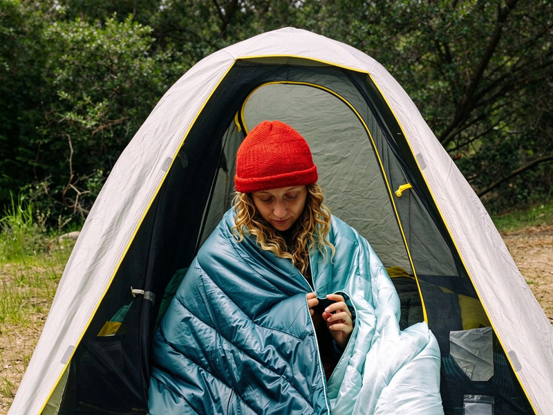
Nearly every card shows the same number twice — regular price and sale price, identical. It is the anti-anchoring move: no invented markdowns, no crossed-out theater, just a stable ticket on product that rarely discounts. The cost is real — a shopper trained by perpetual sales may wait for one that never comes — but one clean price quietly vouches for every other card in the building.
The Park Series as Repeat-Traffic Infrastructure
The National Parks line is the quietest fixture and the most deliberate. Each park gets its own artwork, palette, and woven patch, and the collection reads like a map of places the customer means to go. Landscape becomes inventory; inventory becomes a checklist — buy the blanket, then earn the trip. It manufactures a reason to return that has nothing to do with worn-out gear, and it does so without a loyalty program, a points scheme, or an email drip. The map itself is the retention engine.