OSEA malibu official store browsing experience review

Official product page: https://oseamalibu.com
I visited the site one afternoon with‑out any purchase intention, simply browsing to observe the store’s overall layout. The homepage did not display products immediately. Large, calm lifestyle visuals occupied most of the above‑the‑fold screen. As I scrolled slowly downwards, brand‑focused sections appeared at intervals between product blocks. The homepage content was structured for story‑style scrolling rather than functioning as a concise shopping list.
Product Display and Bundling Layout
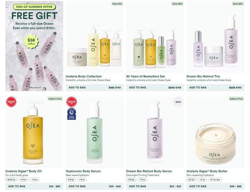
I navigated through the main product categories on the website. Bundle and gift‑set listings occupied more prominent positions within product grids compared to standalone items. Each product card clearly showed a struck‑through original price alongside its discounted price, with corner labels reading “Editor’s Pick”, “New” or “Limited‑Edition”.
A large banner promoting the current spend‑threshold free‑gift campaign was visible near the top of the page. Further down the homepage, an identical promotion block reappeared in a separate section.
Brand‑Values Content Block
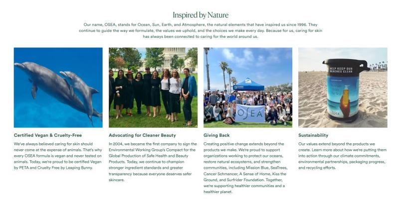
After scrolling past shopping‑focused areas, I encountered a full‑width segment in the middle of the homepage dedicated to the brand’s core values. This section outlined its commitments to vegan‑friendly formulations, clean‑beauty advocacy, ocean‑related charity initiatives and sustainable packaging. Real‑life photographs accompanied the text instead of generic stock images. Most online beauty retailers place this type of background information deep inside an “About Us” page.
Shopping Tools and Navigation
Mid‑way through my browsing session, I located an entry for a skin‑quiz tool near the top of the homepage. Upon clicking it, a short sequence of questions appeared to generate product recommendations matched to skin‑related inputs. A dedicated subscription slider was also placed on the main homepage, listing all membership perks clearly without requiring navigation into individual product pages. Multiple independent entry points for product discovery were available across the site.
Customer Feedback on‑site
Further down the homepage, I viewed the customer‑review showcase. Each featured testimonial included a lifestyle photo and a short excerpt taken from a longer user comment. I navigated around the site attempting to find a centralized review hub with cross‑product filtering options, but no such page existed. Full‑length customer feedback could only be accessed on each individual product page.
Personal Takeaway
I left the browser tab open after finishing my exploration. I had no immediate need to purchase skincare products, yet I enjoyed the unhurried pace of browsing across site pages. Based on my own browsing, I found the site prioritizes brand storytelling over quick checkout paths.