From our place store review: site layout, brand content and shopping experience
Official product page:https://fromourplace.com
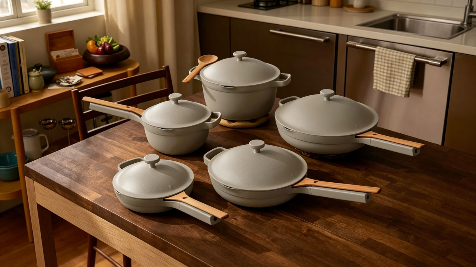
When I first pulled up From Our Place’s website, I was a little surprised. I’d expected to land straight on a grid full of pots and pans. Instead, the very top of the page was just a warm, cozy photo of a real‑life kitchen.
That opening kitchen shot feels really calm and home‑like. Soft natural light spills over the wooden table covered with their cookware. I had to scroll for ages before any actual products even showed up. Kept scrolling and ran into brand stories, little customer quotes, sale banners, plus some random pages that weren’t about buying anything. The site really takes its time, no push to add something to cart right away.
What stood out with their product pages
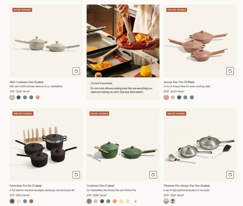
I finally scrolled down into the main product shop section. My eyes landed on the first row of items, and every single one was a multi‑piece bundle. I kept scrolling two more screens, and seven or eight listings in a row were all these big cookware packs. Bright little labels sat in the top‑left corner of each card shouting how much money you would save, like “$70 SET SAVINGS”. Those red savings tags were impossible to miss. I was only after one single frying pan at that moment, so seeing nothing but big sets at first caught me off‑guard. Single pots and pans do exist on the site, but you really need to dig deep past all these bundles before you stumble across them. Each product preview tile has small circular colour dots lined up along the bottom edge. I hovered my mouse over one, and the preview image shifted instantly to show that new colour finish, no click required. It was super handy to flip through shades of sage green, dusty rose, dark charcoal, without opening a brand‑new tab. I originally clicked the “Cookware” menu heading hoping to jump straight to my frying pan. Once inside that page, I spotted another navigation tab labelled Collections off to the side. Out of curiosity I clicked it, and everything changed. This section wasn’t sorted by pan size or lid type at all. Instead, items were grouped around different life scenarios: wedding gift bundles, chef collaboration lines, small‑kitchen starter kits. Browsing here felt more like flipping through a home‑decor magazine rather than shopping for kitchen gear.
How they show off reviews and chef recommendations
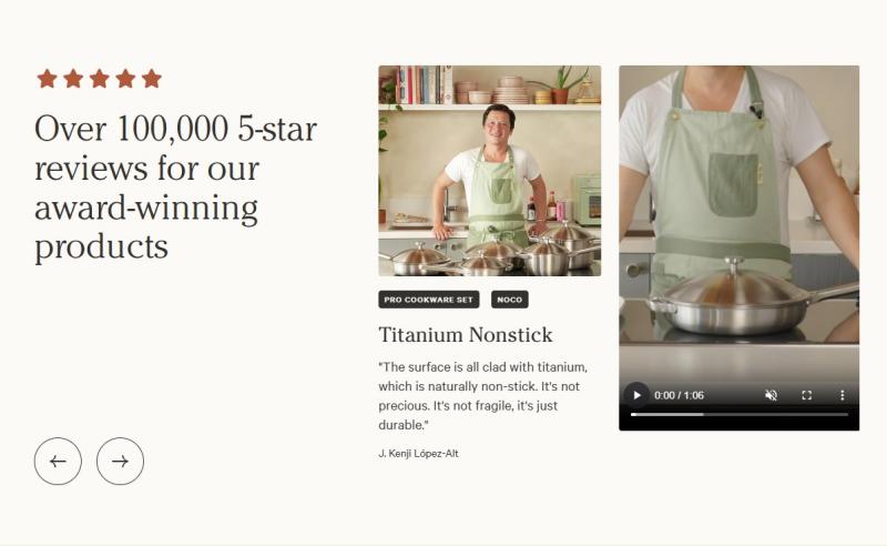
I kept scrolling further down the homepage and suddenly hit their testimonial block. I didn’t expect to see customer praise slapped so high up on the homepage. Most shops hide reviews deep inside each product page. Right here they put up that huge stat: over 100,000 five‑star reviews.
Honestly that number felt pretty overwhelming at first. I immediately wondered how every single review could possibly be five stars. Alongside all those glowing customer snippets, they have quotes from well‑known chefs. I actually recognised one of them, J. Kenji López‑Alt. His photograph sat right next to a short embedded video clip. The video did not start playing automatically; I had to hit the play button myself to watch him talk about the titanium pans. His expert opinion was mixed right in with one‑sentence blurbs from regular shoppers. It reminded me of a few other kitchen brands I have seen online that partner with popular food creators to add credibility to their products. Still, everything on the homepage is positive. No mixed feedback, no negative thoughts anywhere in that section. If I wanted to read the full range of reviews, good and bad, I had to click into every single product page one‑by‑one. There isn’t a single spot where you can scroll through every store‑wide review.
Content beyond just selling cookware
Near the bottom of the homepage there’s a big block of large clickable cards. They link to recipes, a rewards system, friend referral deals, physical store locations and corporate gift ordering. Most websites hide these links as tiny text all the way at the footer. Here those extra pages get almost the same‑sized cards as their product promotions. I might actually revisit the site just to look up a recipe sometime, even if I don’t end up buying cookware today. It’s nice knowing there is fresh cooking content waiting for me, separate from all the shopping noise.
Quick thought on scrolling
The homepage is extremely long. Scrolling all the way from that opening kitchen photo down to those extra resource cards takes forever. There’s no shortcut button to jump straight to the shop page, which can get annoying if you don’t care about reading every section.